Friday, December 28, 2012

December Flamingo Four


Cindy here!  Are you ready for another Flamingo Four?  This month, Melissa, Erin, Abigail and I each received the following four items:


           1.  Patterned paper from Crate Paper's Portrait collection
           2.  Maya Road chipboard frames
           3.  A Jenni Bowlin card  (Fly, Cry, Sit or Play)
           4.  A letter made from MDF  (D, G, H or K)


Melissa's Take:

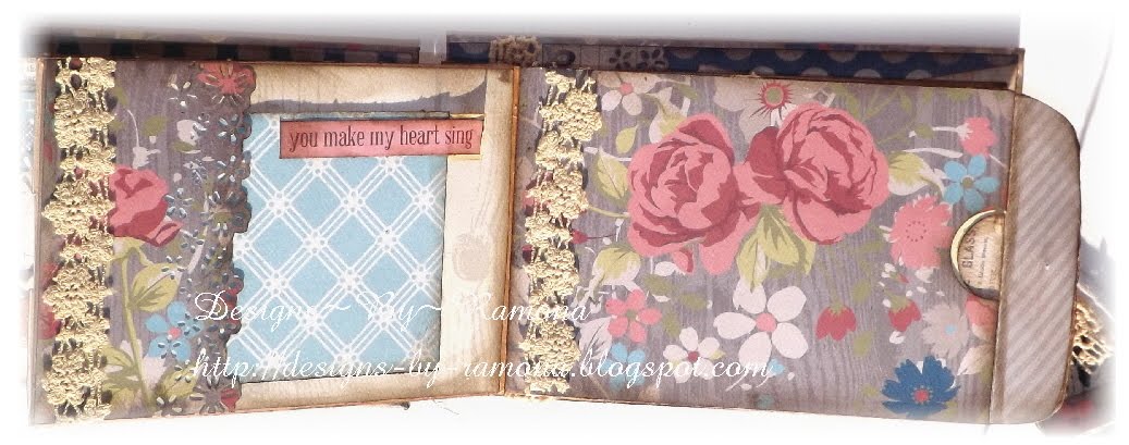
Everyone looks at monogram letters and thinks that they need to make something for someone whose name begins with that letter. I didn't want to do that. Instead, I played around with the frames and realized that the scalloped oval, when placed with the K, looked like "ok" so I went with it. I ended up mounting it on an 8x8 canvas that I panted black and covered with some of the patterned paper squares. I was particularly drawn to the red and thought it popped well between the black and the white of the K. I decided to go with a phrase - to make this art that someone could hang on their wall and inspire them in the moments they need it. From the "ok" came, "Everything will be OK in the end. If it's not OK, then it's not the end. Now sit down and take a breath!" The last part tied in the card I received. The additional frames I was sent further embellished the canvas, and I backed it with the A side of the second sheet of patterned paper, using the B side for the oval one. I added some ink, bling, lace, and Prima flowers to make a perfect inspirational (and beautiful) wall hanging!


Erin's Take:

When I saw the letter and the 3 chipboard picture frames I knew I needed to do something about my children. I usually create off-the-page projects for friends and family as gifts, but this one I am keeping. I used the paper to cover the letter and also to create the two rosette flowers (spiral rolled) and leaves. I used the picture frames as frames for my 4 children, boys in the middle and girls on the top on bottom, using gelatos to color them in. I also used gelatos to color the sides of the large letter. The playing card I was given had a little girl on it, so I cut the little girl out and tucked it with in my cluster of flowers, gems, and leaves. I then played around with the idea of what the “G” stands for with my children, and “Grateful” is what I am for being able to be a mom.


Abigail's Take: 

I used the D as door hanger and thought it could represent the month of December. I love mixing greens, blues and turquoises with reds. I think they just look really happy and fresh and inspiring together. I misted the "D" with a red spray and then ever so slightly inked all the corners to give it a vintage-y feel. I stacked the frames on top of the "Cry" card to make a nice cluster that draws the eye to the phrase on the right side. Stacking the frames gave some dimension and depth to the project as well. I don't like when my projects look one dimensional and flat! I thought the puffy garland in white and blue looked like snow!


Cindy's Take:

When I first saw the items in this month's Flamingo Four, I was stumped.  I couldn't think of anything inspiring that involved an H.  My ever-so-helpful family helped me brainstorm H-words.  Helicopter? Hernia?  Hamburger? Maybe hippo, hand grenade or horticulture?  My son Trevor, inspired by the "Fly" card, drew a picture of a hot air balloon holding up an H where the basket would be.  Somehow, that did the trick.  I had my idea.  I ran up to the craftroom, dug through my alphabet collection, and came up with this:    

 
My husband cut the background board for me while I painted each of the letters a chocolate brown.  While those were drying, I added a quick whitewash to the background board.  I trimmed the Crate Paper to frame my piece, then punched out circles to back the O and to use as holly berries.  I trimmed down the "Fly" card so that the girl's body formed a Y.  I imagined this hanging at our front door, so I used multiple coats of Outdoor Mod Podge to glue and seal each element.  See how shiny?  
 
So what do you think? Isn't it amazing how different the four projects are, considering that we all used the same supplies? We'd love to see your take. If you make something using the same four supplies our designers had, please let us know and we'll feature it here on the blog!


Thursday, December 27, 2012

For You...A Simple Card That Says It All

On Nov 10th, 2012 my husband and I celebrated 11th wedding anniversary.  It was bitter sweet as he was in Afghanistan, our first time being separated on our special day.  So with that in mind, I made him a card to fit our "time" apart and mailed it to him. He now says it is sitting by his computer at his "office" in Kabul.  I got inspiration from a card I saw in a magazine.


I used a simple geometric design to keep the card masculine, but added the Prima flower for a feminine touch of our time together.  The 11 squares represent the 11 years of marriage, and the flower is one to grow on.  I used the clock papers from Teressa Collins to show our time, a great way to use clock paper or clock stamps like the Vintage Finds stamp from Teresa Collins and to show the time you spent doing something. 

Please stop by Flamingo Scraps to find all your scrapbooking wants and desires like those found on this card.

Products Used:
Cardstock
Patterned Paper - Teressa Collins
Flower - Prima
Stamp
Ink - Ranger

Enjoy!!
Erin

Tuesday, December 25, 2012

Pink Paislee Mistable Papers with Heidi Swapp Color Shine

I love to do double page layouts. I think it looks nice when you put them in the book side by side. The papers don't necessarily have to match, but they definitely need to coordinate. These customizable papers by Pink Paislee are called Mistables and are available in the Flamingo Scraps store. There are several styles that come in a package. These papers come in white and sometimes there is a slight print on them, like this one had some handwriting kinda faded in from the edges. They all have a resist pattern. What that means is when you ink, mist, color with markers, paint with water colors, etc, the paper resists the color in some places and absorbs in others. The end result is you have patterned paper in any color you want! You can see here the pretty damask pattern showed up when I randomly sprayed Heidi Swapp Tinsel and Sweet Cherry Color Shine Mists on the papers. The sweet cherry gets much more intense if you dry it completely before wiping the excess off. But, for this page I wanted a softer touch so I sprayed and immediately wiped it off. I like combining colors to get a soft fluid water color effect.

I used more of the Tinsel in the bottom left corner and more of the Sweet Cherry in the top right corner. The pictures of my projects don't pic up near as much shine, or shimmer as this color gives off. Adding Washi tape as a sort of photo corner contributes to the focus of the eye going toward the main picture.

This is a fun embellishment cluster made from a few strips of Teresa Collins Now and Then papers cut into a ribbon cut banner shape, topped with Some Heidi Swapp Sugar Chic paper cut into the tiniest hexagons, stapled together onto the paper and topped with thread and a butterfly.
Popping up the hexagon shapes with pop up adhesive squares adds some dimension and depth. These little hexagons are fussy cut from some Heidi Swapp Sugar Chic paper. I wanted an ink spatter look, but, knowing the resist pattern wouldn't accept the ink, I scattered varying sizes and colors of bling in an ink spatter pattern. It achieves the same look with a little more glam and drama.
My bestest friend ever!
These little blings add interest to the hexagon banner.
Again, I used the blings in an ink spatter pattern across the hexagon. I like how they sort of follow the butterfly!

The second page has more of the Sweet Cherry color than the Tinsel. The mat behind the main photo is actually another paper from the Mistable collection. I just left it white for a nice contrast. These pictures of my wedding were all "outtakes", not posed shots, but they were fun, so I edited and kept them!
Again, using the blings as a substitute for the ink spatter here. I like how you can create an invisible "line" that draws the eye to your focal picture with the ink spatter look.
I just try to imagine how the ink would fall and what it would look like, then apply the blings.
I just love my butterflies!
This photo actually becomes an embellishment when you staple it on the page with a ribbon cut banner! This banner is made from one of the other patterns of the Mistable papers. I left it white and barely inked the edges for some added contrast. This bridesmaid, Brooke, carried our bag of shoes! We all brought house shoes or slippers to the photo session because you know how it is to stand around in heels all day. Thank you Brooke for carrying all of that stuff around!


Be sure to check out the Flamingo Scraps store here and pick up some Pink Paislee Mistable papers and some Heidi Swapp Color Shine to make your own customized patterned papers!

Monday, December 24, 2012

Teresa Collins Now and Then Collection Mini Album

Here's my latest Mini Album from the Teresa Collins collection. I used 2 small pocket envelopes because of a video I had seen on this and decided to change the whole thing around. So if you might be interested on making one of these let me know and I will do a video on how I did this.
When I first got it I thought pretty papers ! I do not want to use them....But  when I started creating this, I found that I am utterly in love with this collection!! As each page went together I was loving it more. I used the paper pack and the embellishments that came in the paper pack. I did have to use 2 more sheets of paper that could easily just use plain cardstock for the tags inside the envelopes.

Here is a list of items I used from Flamingo Scraps that I used on this project.
Maya Road Trinket Pins Vintage Pearl
Maya Road Trinket Pins Hearts & Pearls
Prima Alencon Lace 1
Prima Alencon Lace 2
Prima Alencon Lace 3
Prima Cabachon Lace 1
Prima Metal Treasures Street Lamps
Prima Classic Cream Roses
Teresa Collins Now & Then 12×12 Collection Pack
FANCY CATC-METAL EMBELLSHMT


Friday, December 21, 2012

Easy Stocking Stuffer

Good Morning Flockinistas!
It's Alicia again, here with a really cute and EASY project for you guys using some of the great items you can get in the Flamingo Scraps store!  These "sour cream containers" (so named because of their resemblance to single serve sour cream) can be used as a stocking stuffer, party favor, or treat bag!

To begin, I used some of Pink Paislee's City Sidewalks line paper and cut it into a 4"x 8" strip.
 Then you need to run a strip of adhesive along one of the short edges and along the long edges on the back of the paper.
 Once your adhesive has been applied, roll the strip of paper into a tube and adhere the ends overlapping one another.
 Then, press one end of the tube closed to form a pocket and then fill with your goodies!

Pinch the open end closed in the opposite direction of the way you closed up the other side.  One side will be flat on your table and the other will be standing up.  I used the from the Teresa Collins "Christmas Cottage" stamps to create a cute little label for my treat container.
These can be used year round, just depending on the patterned paper that you choose to use.  Here is a Valentine's themed one using the new "Secret Crush" paper and epherma from Pink Paislee.

Until next time!!
Alicia

Wednesday, December 19, 2012

Place in Time

It's a Graphic 45 kind of day around these parts! I was playing around with one of the Graphic 45 Staples Easel Album in 8x8 and an 8x8 pad of Place in Time, also by Graphic 45. I really thought that it would make a great calendar, combining to two, and I was right!

Check it out:

Supplies used:
Prima Flowers

I'm sure that this particular sheet of paper was meant to be additional embellishments for the calendar pages, but I thought it was a perfect cover page. I trimmed it down a little, and viola! It was a quick and easy solution! I also did a page for each month, and though I won't explain each one, I will show you:


Isn't this the perfect Christmas gift for someone on your list? Each page is its own color scheme, but the design is similar enough that it all ties together. The similar design made it go together relatively easy, as well! Be sure to head over to the store, http://www.flamingoscraps.com/ and add both of these items to your cart and get a quick start (or finish) on your holiday shopping! 

Until next time,
Keep scrappin'!
Melissa


Related Posts with Thumbnails