Tuesday, May 17, 2011

Guest DT Jeana O'Laughlin-Pigott: The Best Things Tag

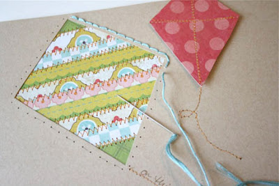
I made this tag for a Webster's Pages tag swap hosted by Tiffany Solorio Morgan. It could be any size but had to have at least 2 embellishments and a sentiment. This is only the second swap I have ever participated in, and everyone's creations were beautiful!! Thanks to all my goodies I have stashed from the Flamingo Scraps store it turned out to be easier than I anticipated!! I am always a bit intimidated by tags, as I feel I don't usually dress them up enough. However, Webster's and Prima make anything dressy!


So, what goes perfect with Webster's? Prima!!!! The paper I used is from the Life's Portrait collection and the edges are inked with Distress Ink in Crushed Olive. The frame and sentiment are from the stamp templates that came with the Teresa Collins Stampmaker (which I won from Flamingo Scraps!!!!). The embellishments are Prima roses, and a Bloomer from Webster's, along with a pearl stick pin from Tiffany. I had a lot of fun making these tags, and hope you enjoy it as well!!


More of Jeana's work can be found here on her blog!!

Monday, May 16, 2011

Shake It Up

Have you ever looked at the packaging from some of your Prima Trinkets or Tim Holtz Idea-ology lines and thought "that has to be good for something. I'm gonna save it!" Some of them have really interesting shapes.

I had to make a birthday card for a friend, and I pulled out my stash of blister packages and made the cutest shaker box on the cover of my card.

From Flamingo Scraps: Prima Reflections Collection Caravan Paper, Tim Holtz Distress Ink Tea Dye.
Other Products: Ribbon, Flower, Party Confetti, Micro Beads, and Chunky Glitter

Inside the shaker, I added confetti from the party store, a few microbeads, and chunky glitter, backed the shaker box with recycled packaging to keep the parts from falling out, and then I glued paper around the outside. To finish the card, I accented the box with ribbon and a flower.

For a complete step by step watch this video.


Recycled packaging never looked so good.


Friday, May 13, 2011

Embrace Imperfection

Here's a layout I made on National Scrapbook Day:

From Flamingo Scraps: Fancy Pants patterned paper
Other: Making Memories stickers; My Sentiments Exactly stamps; Jewelry Essentials rhinestones; ColorBox ink

I made it during a 2 hour Scrapbook.com challenge.  In order to allow enough time to scan, stitch, upload, and link, I really only had about 90 minutes.  I've mentioned before that my scrapping process often involves letting a layout sit half-done for weeks.  It is unheard of for me to start completely from scratch and have a finished layout in under two hours.

Part of the reason is that I like my layouts to be as perfect as possible.  For example, see the word 'valley' in the title?  It drives me crazy that it is crooked, but I didn't have enough time to fix it.  Notice the little heart sticker in the top left?  It isn't quite the right shape.  If this weren't for a challenge, I would have pushed the layout aside and come back to it later when I felt like designing and cutting out a better accent.  The spacing between the pictures isn't totally even, and I don't like the columns of verticals in the center next to the column of horizontals on the right.  The layout is a little plain, the design a touch boring.

Despite all that, I do like the layout.  Yes, there are some things that could be better, but it's just fine.  The most important thing is that I've found a home for the pictures and recorded the story of our first winter visit to Bear Valley.  If I didn't embrace imperfection, I would hardly ever get anything done!

Wednesday, May 11, 2011

The Challenge of a Challenge

I have a fairly distinctive style.  My projects are always clean and simple, feature lots of straight lines and right angles, and use a minimal amount of product.  Occasionally, I'll try to make a layout or card that is completely different than that.  I usually fail miserably, removing product and tinkering with it until it is back to looking like 'me.'

This can be a problem during a challenge.  I refuse to make something I don't like simply to enter a challenge, so I often struggle to make something that fits the guidelines but still pleases me.

One of the Fiskateer National Scrapbook Day challenges was to create a project with two patterned papers, one ribbon, one stamp, and bling.  It didn't sound too hard until I actually started putting things together!  The two patterned papers were easy, but the ribbon, stamp and bling were tricky.  No matter what I tried, I couldn't stand one of the elements and had to remove it.  I was running out of time when I finally found a combination that I really liked.  Here's the finished card: 

From Flamingo Scraps: Fancy Pants paper and flower;
Other: Penny Black stamp; ColorBox ink; Doodlebug brad; unknown ribbon

It meets all the requirements (the bling is the sugar-coated brad), but I think it is still very much 'me.'  Would you agree?  I greatly admire the artists out there who are able to do so well with a wide variety of styles, but I've learned that it just not me.  While it is important to stretch creatively, I've learned to be true to myself and embrace my distinctive style.

Tuesday, May 10, 2011

Guest DT Heather Landry: Splash!

Hi everyone! I'm really excited to be back here on the Flamingo Scraps blog as a guest designer! I thought it would be fun to spotlight sketch blogs with each of my guest design team posts this month. In each post, I will include a layout that I created that was based on a sketch. It will also include links to two more sketch blogs in each post. I thought it would be a good way to let the readers know what's out there for inspiration!

The first layout that I made is based on a lovely sketch by Sketch Support. Click on the link to go to the website and see all of the wonderful pages by their design team too! I particularly love the sketches on this site because they appeal to my love of clean, graphic design. Here is the layout I created...


The only thing on this page that didn't come from Flamingo Scraps is the Kraft paper! I used the Cosmo Cricket Salt Air paper, doilies, chipboard, and stickers that I purchased. I also used Salmon Maya Mist to change the color of the Prima flower. It used to be white. The white was too bright and clashed with my page so I sprayed it. I really love how the glitter still shows through! The background was also misted with Maya Mist in Seafoam Green. It adds a watery look that I thought went perfectly with the layout's subject matter. I used old Prima packaging from my last order from Flamingo Scraps on this page too! It works really well as a mat for my large photo. I made the clear packaging stand out by inking the edges with more mist. I sprayed the mist into a paper towel and then rubbed carefully around the edge. I also embellished the layout using a Prima e-line flower and some Prima gems.

Here are your links to two more inspirational sketch blogs! Be sure to bookmark them for tons of inspiration when you are ready to use your Flamingo Scraps goodies.

1.) Sketchy Thursdays  I love the fact that their sketches usually feature lots of white space. They really challenge me to use my supplies creatively!

2. ) Sketch Inspiration Not only do they have sketches there but they also have an amazing community where you can upload your creations to a gallery. I get lots of comments on my pages there because the ladies are so friendly.
More of Heather's work can be found here on her blog!!

Monday, May 9, 2011

Deckled Edges

I always rip and grunge up the borders of layouts. But lately, I have wanted a fresh new look. Something that is a little more sophisticated, but still gives the feeling of an uneven edge.

Once again, **DING, DING** Inspiration from Prima. When I pulled the products for the layout below, all that luscious Prima packaging and its deckled edges SCREAMED "Duplicate Me".


So I went to my tool grave yard, and resurrected these gyms.


I used the scissors around the border of the backing cardstock, and along the border of the photo mat. After looking at this layout, I’m sure you will agree, these scissors could make a comeback.


From Flamingo Scraps: Prima Trinket Collection Madeline, Flocked Rub-Ons-Reflections, Delightful DayCollection- Hush and Splash, Say It In Crystals - Vintage Rose Smoke, Accent Gem Studs, Madeline Paper Collection Beautima and STE Marie, Lace bleached Interlaced, Butterfly Kiss Collection Madeline; Tim Holtz Distress Inks Vintage Photo and Aged Mahogany; Glimmer Mist Rose Tea

Other Products: Cardstock, Deckled Edge Scissors.

Next time you are making a card or layout, and I stress ONLY IF IT IS APPROPRIATE, experiment with the deckled edge scissors in your own tool grave yard.


Friday, May 6, 2011

Weekend Whimsey: Kate's Dress!!

As long as there have been rumors swirling about the engagement of Prince William and Kate Middleton, there has been speculation about what her wedding dress would look like.  What would influence her choice, who would design the gown?? 

On the 29th, Catherine emerged at Westminster Abbey in a perfect, classic, 1950s inspired gown that surpassed expectations.  "People Magazine" attributed the design as influenced by Princess Grace of Monaco's lovely 1956 lace and satin gown -- but I know better!

You see, I will always subscribe to the fantasy that somehow, somewhere, the House of Alexander McQueen came across a picture from the "Jacksonville Times-Union" from August 1952 and saw the dress that would inspire the royal gown!

Catherine, Duchess of Cambridge -- April 29, 2011
and that gown was my mother's!!!!

Della Jeanne Hill Pickens -- August 1, 1952

I wore my mother's dress when I married and felt like a princess!

Suzanne Stuart Pickens (Wylie) -- March 28, 1981
No matter what the fashionistas say, I will always see my mother's (and my) dress when I see pictures of the future Queen of England!

Friday Finds: Reverse Applique, Adorable Disney and a Beautiful Spring Card!

It's been a few weeks since our first installment of this series... a few things have caught my eye since then!


Love this brilliant idea for using reverse applique on a layout!  Especially given my recent, hopeless addiction to my We R Memory Keepers Sew Easy tool (seriously, just ask Susan and Suzanne!)... now I want to try this technique!


What can I say, I'm a sucker for mickey punched heads (evidenced here!) and this adorable layout on the Pink Paislee blog makes me want to scrap some more Disney layouts!

And last, but certainly not least....


Check out this beautiful card by Legend of the Flock, Diana Fisher!  I'm totally in love with it!!

Hope everyone has a fabulous weekend... do you have scrappy time planned for National Scrapbook Day?!

Wednesday, May 4, 2011

In the Details

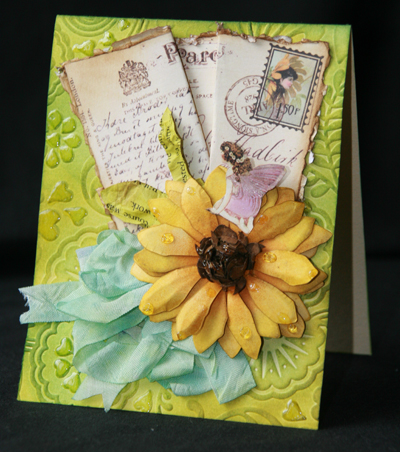
The difference between a flat store bought card, and a hand made card is in the details. The personal touch of a handmade card, screams I loved you so much, I spent some time on just you! When I receive a hand made card from someone (no matter the age), I treat it like a painting from a museum. It gets proudly displayed in my craftroom, much like Christmas cards adorn your home during the holidays. I NEVER toss them out!

I love the details that can be created on such a small canvas.

From Flamingo Scraps: Graphic 45 Once Upon A Springtime Woodland Fantasy; Ranger Glossy Accents; Tim Holtz Distress Inks in Crushed Olive, Mustard Seed, Wild Honey, Walnut, Tumbled Glass, and Vintage Photo.

Other Products: Provo Craft Emossing Jacket; Tim Holtz Tattered Florals Die, Martha Stewart Hydrangea Punch, Gelly Roll Clear Star Pen; Seam Binding Ribbon, Zutter Distress It All.


I created this card with the Graphic 45 Once Upon A Springtime Pixie Post papers. Look at the details closely.

The embossing and coloring of the card's background give depth and texture. They take you straight to the tropical rainforest. The tattered post card that is dressed, bent and folded looks like it has been tossed around by the wind.

Notice the postage stamp on the postcard.


Yes, the flower used as an accent piece is colored just like the one in the postage stamp on the postcard. This is a very small and hardly noticeable detail, but it was definately. The Fairy sitting on top of the daisy is similiar to the one in the postage, and she is positioned like she is reading the card. The coloring and folding technique of the daisy gives the flower texture and depth like a real flower. But the best detail of all, is the sprinkles of glossy accents around the card to give the effect of rain drops or dew.

I don't know if I am more excited to create one of these masterpieces for a special someone, or to receive one. How 'bout you?

Tuesday, May 3, 2011

My Scrapping Process

I'm fascinated by the process that other people use to scrapbook.  Everyone does things so differently!  Here's my process:

1) I always start with the photos.  I spread all my photos on a sheet of either white or cream cardstock, then start arranging and rearranging.  I crop photos some down.  Eventually, I settle on which photos I'll be using and where they will be on the layout.


2) Next, I choose my patterned paper.  This is usually the step that takes me the longest.  I agonize over what to pick.  This time it was actually very fast, as I knew I wanted a green, orange, and blue palette, and these Fancy Pants papers had just arrived from Flamingo Scraps!  Perfect!


3)  Next I decide which color will be my background, which will be the photo matte, which will be an accent, etc.  This often takes me a long time too.  I almost always walk away from a layout at this stage and come back to it the next day or so with a fresh eye.  Sometimes layouts stay at this stage for weeks or even months!


4) Next, I decide where my title and journaling will go.  This is sometimes a problem, as I rarely leave enough space for both a title and the amount of journaling I want to do.  Usually, I come up with a solution, but if I don't, then I'll look for a sketch.  I try to find one that matches what I already have- in this case, a vertical block of photos and a horizontal band of color.  Here's what I found:

Sketch from Scrapbooks Etc., October 2008.

It looks very similar to what I already had, though both reversed and flipped.  Looking at the sketch, I realized I could crop my top photo and create a journaling block from the extra space.

5) Once I know where my journaling and title will go, I use random chipboard letters to check that I like the title placement.  I don't put too much effort into finding the correct letters- as long as they have the same basic shape, it's good enough. 


6)  My next step is to adhere the photos, patterned paper and title to the background paper.  I leave the journaling block loose.  I place embellishments where I think I might want them. 


7)  The last thing I do is journaling.  I don't usually pre-plan what I'm going to say, so I'm lucky that it usually works out and looks good! 

From Flamingo Scraps: Fancy Pants patterned paper
Other: Fiskars border punch; Queen & Company flowers and brads; Paper Company cardstock


Monday, May 2, 2011

Getting to Know Jeana & Heather!!

Please join us in welcoming our May Guest Design Team -- Jeana and Heather!!   Heather will be here on Tuesdays and Jeana will be here on Thursdays this month.   So we asked them both to answer a few questions so we could all get to know them a little better...

My name is Heather Landry, and I am from Southern Louisiana. I am a total country girl at heart. I love everything about Louisiana except for the heat and mosquitoes. I have been married for ten years now to a hilarious, annoying, wonderful man. I have three kids: Alexis Ariel (7), Jordan Jasmine (5), and Brandon James (2). The girls chose their own middle names when we adopted them. They both wanted to be princesses!  (I’m pretty sure that makes me the queen right?) Brandon messes up the scheme of things name wise! Being the mother of two special needs kids is always an adventure, one of my favorite things to tell my husband is, “scrapbooking is cheaper than therapy”! I’m not sure he’s buying that anymore though. 

Why do you scrapbook?
I love telling the story of our lives on my scrapbook pages. That’s really what it’s all about for me.

What is the one scrappy item you just can't live without?
I can't live without a great trimmer that cuts clean, even lines. I finally found one that works for me and it makes my heart happy!

If you were a crayon, what color would you be?
Lime Green! Kinda bright, artsy, and totally funky!

Do you like your handwriting and do you use it on your layouts?
I've learned to like it because I know how important it is to pass down to future generations. I have cards from my grandmother who passed away that are absolute treasures of mine.

What is your favorite item in the Flamingo Scraps store today?
The Cosmo Cricket Salt Air line. Hands down! It is absolutely adorable. You'll be seeing some of it on my upcoming layouts for my guest design stint here!

More of Heather's work can be seen here on her blog!


I am a SAHM of 4 wonderful children, Mason (4) Kira (2) Frankie (2) and Tre (17 months) so it gets a little crazy around the house sometimes, but I wouldn't have it any other way :D. I am also a proud Army wife to an amazingly kind, understanding, gorgeous husband!! The kids and I currently live in Las Vegas, NV where my husband and I have both lived for most of our lives. We are all excited for the adventures that being an Army family will bring, and I am extremely happy that I have crafting to keep me sane along the way LOL!!!

Why do you scrapbook?
It started out with making cards (way back in 4th grade with my bestie Tiffany Solorio Morgan) haha, who knew we would be the scrappers we are today!! Mostly I scrapbook because 1) it is relaxing for me and 2) I love being able to give  people things that were personally hand crafted just for them.

What is the one scrappy item you just can't live without?
Well, anyone that has seen my scrap space would know this one, fibers!!! I am a fiber addict; be it ribbons, lace, twine, you name it I love it!!

If you were a crayon, what color would you be?
I guess I would be my favorite color! Deep olive green (is that even a crayon color hahah!?) because it's flexilbe. It can be subtle or bold, compliments pretty much anything, and is always calming.

Do you like your handwriting and do you use it on your layouts?
I do like my handwriting, and I use it in my layouts quite frequently as I like how versatile it can be (we all know it can change from day to day!!)

What is your favorite item in the Flamingo Scraps store today?
Oh gosh, this is soooo hard for me to answer, there are so many gorgeous things!! I would have to choose the Fancy Pants line Wishful Thinking, I can't get enough of it!! It is so girly, and can be used for girls of all ages!! I love that it's a mix of sophistication and whimsy ♥

More of Jeana's work can be seen here on her blog!


Please join us this month to see their fabulous work... we can't wait!!

Guest Design Team Summary: Janie & Sara

We're scrambling today to catch up from our scrappy vacation at Flamingo Scraps!!  Last month, we really enjoyed Janie & Sara's blog posts and we hope you did too!! Each month, we post a summary just in case you missed anything and to thank these talented ladies for all their fabulous work!! Up first this month is Janie:

During April, Janie inspired us to break out our distress inks with her 1st Birthday layout, shared her experience at Scrapfest, made a beautiful canvas tribute, and for April's Flamingo Four she made a fabulous decorated dress form!

More of Janie's work can be seen here on her blog!

This month Sara inspired us to use Maya Road Bottlecaps (so cute!), made a gorgeous layout using Websters Spring Market, taught us how to make a border with flowers and, for April's Flamingo Four, she made a super cute layout about her dates with her son!

More of Sara's work can be seen here on her blog!

So we really hope that you enjoyed what Janie and Sara shared with us during April as much as we do!  Please go leave them some love if you haven't already!!   Later today, we will be back to introduce our May Guest Design Team!! :) 

Guest DT Sara Zenger: Flower Borders

If you are like me when flower were first introduced to the scrapbooking world you bought them all!!! Now more embellished and detailed flowers on the market (and they are beautiful!) but don't give up on your original flowers yet, here is a unique way to put them to use!

From Flamingo Scraps: Prima flowers

This is a gift card holder I made and but I want to show you how to create the flower border so you can replicated it on a layout, card or any other project! Its easy!


Select your flower (the amount will depend on the size of your flower and the length of your boarder). I have chosen 2 colors and I will alternate them.


Fold your flower in half.


Fold your flower in half again.


Glue dot your folded flower to the back side of your boarder.


Repeat this process until your border is full!!


And their you have a fun new border!

Enjoy!
More of Sara's work can be found here on her blog!!

Gone Scrappin'....

So sorry we've been MIA for a few days... we've been scrappin' and laughin' and having a good old time in Michigan!  We're back now and we will catch up the blog later today...  which means a few more posts today.  :)  We also have a few layouts to share with ya... and this picture:


Aren't Susan and Suzanne too cute?!  :)

Thanks for understanding and we hope you enjoy all the posts! 

Wednesday, April 27, 2011

One Sketch, Two Looks

I love working with sketches.  Before I tried them, I used to think that they would limit my creativity, but in fact, the opposite is true.  Sketches often take me out of my comfort zone and challenge me to work with shapes or layouts that I wouldn't typically come up with on my own.

This is a sketch by Rebecca Peck:


It's really simple, which I like.  I decided to see if I could make two cards, both based on the sketch, that look completely different from each other.

For my first card, I used Prima's Rebellious collection.  It follows the sketch fairly closely.  I didn't want to cover up the cute bird paper with a solid circle, so my solution was a semicircle of Stickles dots, connected with a pen. 

From Flamingo Scraps: Prima patterned paper; stickles
Other: Bazzill cardstock; Fiskars border punch; Zig pen

For the second card, I used Prima's My Mommy and Me collection.  I love the embossed leaf paper and didn't want to cover it with a solid circle either!  I laid out a piece of embroidery floss with the intention of hand-stitching a semicircle, but I couldn't get it to lay flat to see if I liked the design.  Then I realized the curvy floss would make such a cute balloon string!  In the end, I used a pen to draw the string and ditched the floss (and the semicircle) altogether. 


From Flamingo Scraps: Prima patterned paper
Other: Bazzill cardstock; Fiskars border punch; LePen marker; vellum; ColorBox ink; Hero Arts stamp


This sketch was so much fun!  As far as making two cards that look completely different from one another... mission accomplished!
Related Posts with Thumbnails