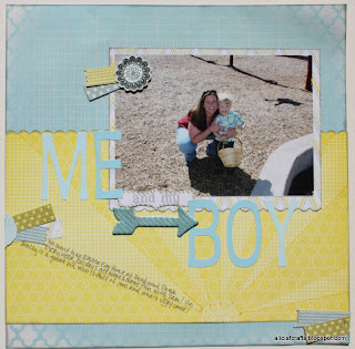
It's Alicia, here again with another layout using Heidi Swapp's Serendipity line. :) Sometimes, inspiration comes from the strangest places. While flipping through a magazine, last fall, this ad really had something that caught my eye, so I kept it in a binder so I could refer back to it when the time was right.
Initially, I thought that it would be the ombre effect of the blue pellets that would be my jumping off point, but when I saw the "sun rays" in the yellow Heidi Swapp Serendipity paper, it brought this ad to mind,and I had to dig it out.
I traced the lines of the "rays" with a yellow marker to define them a little better, without making them standout too much. In place of the product in the ad, I flipped the design and placed my picture on the right side, instead of the left. The letters that I dug out of my stash for the main part of my title play on the ombre effect, like the pellets in the ad.
Here is the side-by-side comparison... not an exact replica, but you can definitely see the inspiration that was sparked by the ad.
Products used in this layout:
Don't forget to always be on the look out for inspiration!
Until next time!Alicia


I LOVE this Alicia!
ReplyDeleteLove your layout and your picture!! Your boy is just the cutest!!
ReplyDelete