Friday, September 23, 2011

Goosebumps


Today I would like to introduce you to a new product from Tsukineko called GooseBumps. It is a clear texture gel medium that acts as a resist while also providing an “orange peel” like texture to the surface of your project.


For my project sample I used it as a resist with a Prima mask to create a great texture on a mini notebook I’m sending to a friend.

I started with a mini Kraft notebook that I got from a $1 bin at a local craft store.
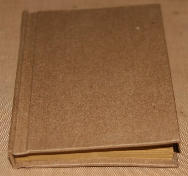


I used Honey Dew Glimmer mist and Peeled paint distress inks to color the background of my album cover.


Once the base coat color has been applied to the entire surface, cover your work surface so that the over spray does not ruin your table top.


I positioned a Prima mask over the notebook cover then sprayed the GooseBumps over the mask making sure I covered the entire notebook. Immediately remove your mask and wash it with warm soapy water to remove the Goosebumps residue.

Allow the Goosebumps to dry (usually 5 – 10 mins on its own), or you can speed up the process with a heat tool.

This is what your project should look like. You can really see the resist on the project, and this would be great left as is. But adding a little more color will really help you see the texture.

I chose a heavy contrasting color – Aged Mahogany distress ink to resurface my notebook cover. I applied the color using an ink applicator tool.


Use a baby wipe to remove the excess color from the top of the Goosebumps.


You can really see the two toned effect now, and the second color enhances the texture of Goosebumps.

From Flamingo Scraps: Various Lace & Trims, Prima: Screen, Flowers; Tattered Angels: Honeydew Glimmer Mist; Ranger: Crackle Accents, Tim Holtz: Distress inks Peeled Paint & Aged Mahogany; Maya Road: Tickets.
Other: Tsukineko Goosebumps


Then I decorated the cover of the book and it is ready to send off to a friend.

I could see me using this product on frames, cards, scrapbook pages, tags, flowers, and so much more. The possibilities are endless.

Thanks for stopping by,

Wednesday, September 21, 2011

Little Details

Back in June, I blogged about the zoo-themed birthday parties Trevor had when he turned five.  Here is the layout from the celebration with his friends at the Oakland Zoo.  I had so much fun putting this together- I love the bright colors of the pictures and wanted the layout to be equally fun and happy to match the spirit of the party. 

From Flamingo Scraps: Fancy Pants patterned paper, Crate Paper patterned paper, Tim Holtz grungeboard, Stickles
Other: Folk Art paint, Paper Pizazz vellum, Queen & Co. brad and button, Marvy circle punch, unknown ribbon

What I like most about this layout are the little details.  With twelve pictures and bright lime/orange papers all demanding the viewers' attention, I needed to keep the embellishments simple, but not so plain they'd be lost.  I started with the grungeboard 5.  I painted it orange, rubbed it with orange Stickles, and then tied on the ribbon.  I used the same Stickles to cover the brad and to fill in the center of the star-shaped button.  I edged the vellum circles in Stickles. 

I love the way the dotted vellum sets off the 5 and the date.  I'd originally used the same dotted vellum for the journaling, but it was hard to read.  I switched to a plain vellum and it looks much better.

Such a fun layout and such great memories from a fantastic day!


Tuesday, September 13, 2011

Cindy's Glossy Accents Project

Last week, Tonya posted a tip about how to keep Glossy Accents unclogged.  In the comments, I said that I needed a post telling me how to use Glossy Accents, since I never use mine!  She responded on Friday with a new post which showed 5 projects using Glossy Accents and Crackle Accents.  At the end, she challenged me to use Glossy Accents on my next project.

Well, there's something about being called out by name in front of hundreds that motivates a person to accept a challenge!  I was most inspired by Tonya's use of Glossy Accents to make a 'dewdrop' on a flower.  I was thinking about that as I was walking to pick Trevor up from kindergarten, my feet crunching the zillions of acorns on the sidewalk.  I picked up a large handful of acorns and decided to experiment with Glossy Accents on them.

Of course, the second Trevor saw me he noticed that I had a huge handful of acorns.  He was instantly curious about what project I had planned for us to do together.  I told him we'd be making napkin rings.  He said, "Great!  What are napkin rings?"

Here are mine:


And here are Trevor's:


They were fun and easy to make.  I started by cutting an empty toilet paper roll into 6 rings, which we then painted with fall colors.  While they were drying, we stamped oak leaves using Staz-On, added Glimmer Mist, then did a color wash of paint over that.  (Actually, that's what I did- Trevor did the first one that way and used crayon on his next two.)  After  I did the fussy cutting, I coated my leaves and acorns with Glossy Accents.  We left Trevor's plain for contrast.

When everything was dry, we tied string/ribbon around the rings and used Glossy Accents to attach the leaves.  I used the glue gun to attach the acorn, as I wasn't sure if Glossy Accents was intended to hold that much weight.

Here's a closer look at one of my napkin rings:

From Flamingo Scraps: Glimmer Mist
Other: Glossy Accents, Folk Art paint, Staz-On ink, Stampin' Up stamp, unknown twine/ribbon


What a fun project!  Not only did the Glossy Accents work well as an adhesive, but I love the shine that it provides.

Amanda, it's your turn!  I challenge you to make a project using Glossy Accents.  Can't wait to see what you create!

Friday, September 9, 2011

Glossy Accents

Last week Cindy asked for a post on how to use her Glossy Accents that has been collecting dust since she bought it. So today I thought I would share with you a few examples of how I have used mine.

Glossy Accents & Crackle Accents are essential mediums in my scrapbooking kit. Glossy Accents is a ultra-thick glossy glue medium that can be used as a sealer or as a strong bond adhesive. Crackle Accents is the same as Glossy Accents except it gives the effect of cracked glass when it dries. Both of these products go beyond simple glue & stick.

In this example: I used the Glossy Accents to add the effect of Dew on the flower. I just dripped a few drops and let it dry overnight.


In this example I had some rub-ons that were old and cracked I wanted to use them on this project but I was afraid that they may rub off over time, so I covered them the letters with Crackle Accents and now they look like I cracked them on purpose. They Accents also makes them appear raised for a glossy embossed look without the messy powder and heat tool.


In this example I used the Glossy Accents to adhere the jewels to the ring base giving them a durable permanent bond.

In this example Glossy Accents was used as an adhesive to glue the paper to the back of the fragment charm.

In this example I used the crackled accents on the face of the clock to give it the look for cracked glass but it also protects the paper from tearing during use.

Cindy I’m going to challenge you to break the seal on your Glossy Accents and use it on your next project.

Monday, September 5, 2011

Keeping Things Fresh

I never get tired of scrapping egg dyeing, pumpkin carving, gingerbread making, or other holiday traditions.  Even though these happen annually and the pictures can look pretty much the same from year to year, I still look forward to scrapping them.  I don't worry about the layouts looking similar over the years.  Even if they are, they aren't next to each other in the albums, so it doesn't bother me.

It's a bit different with some of our vacation photos.  My inlaws own a cabin in Bear Valley, California.  2011 was the first time since I've been in the family that they didn't rent it out during the winter.  We took advantage of the free lodging, going to the cabin in January (a winter wonderland), April (just following a record snowfall that nearly covered the 3-story cabin), and Father's Day weekend (still quite snowy). 

In my mind, the trips were extremely different from one another.  We brought along family friends in January, invited Trevor's godmother in April, and just the three of us went for Father's Day.  The weather was different and we did different things each time.  However, the photos from all three trips look fairly similar- a whole lot of pictures of us sledding and enjoying the snow.  And the trips were close enough together that the pages would be in the same scrapbook.  My goal was to make the three pages distinct enough that it wouldn't seem like I'd scrapped exactly the same thing three times.

Here's the page I did following the January trip, which I talked about in this post:

From Flamingo Scraps: Fancy Pants patterned paper
Other: Making Memories stickers; My Sentiments Exactly stamps; Jewelry Essentials rhinestones; ColorBox ink

Here's our April visit:

From Flamingo Scraps: Stickles
Other: SEI and Provo Craft patterned papers, Fiskars border punch, unknown snowflake punch

And here is Father's Day:

From Flamingo Scraps: Stickles
Other: Provo Craft patterned paper, EK Success sticker, unknown snowflake punch

Even though I used blue for each of the three layouts, I used various shades of blue.  I chose pictures that emphasized the differences between the trips, and laid them out differently.  The fonts, journaling style, and embellishments are different on each.  I didn't repeat any title words.  I think the three layouts are as distinct as the three trips were.

How do you keep things fresh when you scrap similar-looking photos from different events? 

Saturday, September 3, 2011

Weekend Whimsy: Boys of Fall

I'm not really sure what it is that first attracted me to Football. Maybe it was always the "hot" guys, perhaps it’s the sweat, the passion, the fight, the grit, or maybe even the smell of the grass. Whatever it is, I know one thing - I’m a total football girl. From Thursday - Monday Night from August - January the only thing I think about is FOOTBALL.

It started at a young age, watching my brother play while my Mom & Dad volunteered our Saturdays away. Now I am the one volunteering my Saturday’s away for the local Pop Warner Football league. I often tease and say it’s my Legacy. On any given Saturday from September - November, I can be found lying in the grass taking photos as the kids swoon past me scoring touchdowns, stopping plays, or causing fumbles. I love being the one in the end zone that the kids look at and say "Did you get it?"


That passion carries on into college football. If I can’t watch the local college teams play live, I spend my free time on Saturday Nights and Sunday’s parked in a chair next to my Daddy and his DVR catching up. Call it deep rooted southern tradition. Call it passion for the game. I call it Daddy/daughter bonding time.

On August 25, I watched my son play his first junior varsity game. The pride that swept over me as I watched him score his first touchdown was overwhelming. He has played since he was 7, but every time he takes the field, a part of me steps out there with him. I captured this off his Facebook status as he prepared for this week’s game:

"23 hours I’ll be on the field waiting for that football to be kicked off butterflies in my body but as soon as that ball is in the air they will rush out and the Brighton everyone else knows will leave with them and for the next 2 hours I will be a different person all for my 1 and only true love...FOOTBALL"


Tonight I posted photos from the game, and again my heart skipped a beat when my photos end up as the "profile" photos for the Boys of Fall!


Friday, September 2, 2011

Glossy Accents Tip

So I had the pleasure of meeting Tim Holtz at one of his workshops back in May. If you have never taken one of his classes - well all I have to say is - WOW! It should be on your bucket list. AWESOME.


I wanted to share with you today a tip that he had for Ranger's "accent" glue lines.
Does your Glossy Accent's Tip look like this?


Are you guilty of trying to unclog the fine tip with a pin or piercing tool? UMM Hand raised - GUILTY!

Well Tim says "If you tap the bottle one time firmly on the table after each use, then gravity forces the glue out of tip and back into the bottle. Your Glossy Accents will NEVER clog again. However, if you pounce twice - then the glue is actually sucked back into the tip and it will clog."

Also do not store your Accent bottles upside down. (I'm guilty) because these glue mediums are designed to be used in large thick quantities, and the glue will dry in the nib.

Hope this tip will ease some of your frustration.

Monday, August 29, 2011

Making Do

Imagine if you will... I was working on a layout about our July 4th.  I had the perfect patterned papers, pictures, and chipboard stickers.  It was all laid out- the finishing touch would be three stars, arranged in a visual triangle.  I knew just what stars I would use (some funky self-adhesive ones from BasicGrey).  When I went to get them.... uh oh.  Only two left.

Darn it!  Time to make do.   I found a random piece of chipboard and cut out a star shape, mimicking the style of the ones I wanted to match.  The color was different, so I painted all three pieces "Country Twill"- a color that looks like raw chipboard.  I inked the edges and added the stars.

My star isn't exactly the same as the BasicGrey two, but it's close enough.  Can you guess which one I made?

From Flamingo Scraps: Moxxie patterned paper, BasicGrey chipboard stars
Other: We R Memory Keepers patterned paper, Bazzill cardstock, EK Success punch, Folk Art paint, Reminisce stickers
Inspired by: Shannon Zickel, scrapbooks etc. August 2011

Mine is the large one.  I'm happy with it.  Pretty good for making do.

Monday, August 22, 2011

My Many Manufacturer Challenge

I'm not a very product-heavy designer.  My layouts tend to be very simple, with just cardstock, some patterned paper, a little ink, maybe a punch, some letters, and a simple embellishment or two.  In that regard, this layout is no different:

From Flamingo Scraps: Fancy Pants patterned paper, Tim Holtz grungeboard
Other: BasicGrey patterned paper, Recollections cardstock, Fiskars border punch, Marvy circle punch, ColorBox ink, Making Memories stamp, Rubber Stampede stamp, Stampin' Up pen, Sketch by Shannon White

But this layout is actually very different from what I usually make.  Every component of this layout is from a different manufacturer.  In fact, 10 manufacturers (and one sketch artist) are represented on this simple page. 

I didn't originally set out to do this.  I knew I wanted to work with BasicGrey patterned paper.  I happened to have some of the gorgeous Fancy Pants scraps from a previous project still out and I loved how they looked together.  I punched some circles from the Fancy Pants using a Marvy punch, then used a Fiskars border punch on Recollections cardstock.  As I was picking up my ColorBox ink, I realized that I'd already used six manufacturers without even trying.  How many others could I use?  I added the Tim Holtz grungeboard and stamped the words "So" (Rubber Stampede) and "Together" (Making Memories).  I did my journaling with a Stampin' Up pen.  That makes ten!

The layout is based on a sketch from the always-fabulous Shannon White.  I rotated it 90 degrees.


I really enjoyed my own little private Many Manufacturer Challenge.  I may just have to challenge myself to beat my own record.


Thursday, August 18, 2011

Self-Portrait

I never show photos of myself, and I really don’t know why other than the fact that I’m always the one with camera. So for this week’s share I decided to do a little self-portrait layout.


From Flamingo Scraps: Prima: Innoscence 2 flowers, Marion Smith's Trinkets, Bling.
Other: Bo Bunny Razzi Mamma paper, Graphic 45 buttons, Lindy's Stamp Gang, Tim Holtz film strip tape, charms, Houseof3 digital file.


Yep – that is me with the big camera hanging out at a youth sports field taking action shots. I think every child in my area has been photographed by me at least once. For my self-portrait layout I included all my favs.


I used the Bo Bunny Razzi Mama paper for the layout, and then added a spray of my favs. Marion Smith’s Trinkets, Prima bling, and Prima Innoscence 2 Flowers, and of course Tim Holtz’s film strip ribbon.


The transparency at the top was melted with my heat tool to give it a little interest. I got the image from the House of 3 during the 21 day challenge. It has a lot of uplifting phrases to remind me to look at things differently and stimulate creativity.

Have you done a self-portrait? Every now and then it is healthy to let someone else take the photos.


Tuesday, August 16, 2011

Guest Design Team Summary: Jen & Julie

We scheduled this to run and it did not.... and I just noticed, so many apologies to Jen and Julie!! In July, we really enjoyed Jen & Julie's blog posts and we hope you did too!! Each month, we post a summary just in case you missed anything and to thank these talented ladies for all their fabulous work!! Up first this month is Jen:

During July, Jen made a gorgeous layout about her Grandma, shared her beautiful cards, showed us an amazing mini album just waiting for photos, and for July's Flamingo Four she made an adorable altered little box!

Jen's blog showcases her beautiful work and you can also catch up with her youtube channel!

This month Julie shared her gorgeous layout of her father's photos, made us laugh with her as she shared her mom's funny story, scrapped her son's love for his sister, and for July's Flamingo Four she made a beautiful fussy cut card!

Want to see more of Julie's cute layouts and adorble pictures of her daughter Brookie?!  Go check out Julie's blog!

So we really hope that you enjoyed what Jen & Julie shared with us during July as much as we do!  Please go leave them some love if you haven't already!!  

Saturday, August 13, 2011

Weekend Whimsy: Staying Creative on Vacation

For the past 11 days, I've been here:

Sea Princess, docked in Victoria B.C.

Dyea, Alaska.  Those lumps in the water are salmon jumping.

Tracy Arm Fjord

We had a wonderful vacation aboard the Sea Princess.  We traveled round-trip from San Francisco, stopping in Victoria B.C., then Ketchikan, Juneau and Skagway, Alaska.  We saw whales, bald eagles, and a grizzly bear.  We panned for gold and rode a sled pulled by a team of dogs that included Iditarod veterans.  We ate a lot.  This was my fourth time cruising to Alaska.  I highly recommend Princess Cruises and the Inside Passage in general.

I've never brought crafting supplies with me on a cruise.  Taking scrapbook stuff is out of the question- I'd need too many things, I wouldn't have space to work, and I'd risk damaging my supplies.  But taking a different sort of small project sounded doable.

For months, I've been wanting to try drawing a mandala.  Mandalas are basically abstract designs based on a series of concentric circles.  Drawing them is supposed to be relaxing- sort of an organized, calming form of doodling.  All you need is paper, a ruler, and a compass.  That would be simple to fit in my luggage.  And since I wasn't flying, I didn't have to worry that the TSA would consider my compass a lethal weapon.  I carried my supplies with me pretty much the entire cruise, so whenever I had a few minutes, I pulled out my stuff.


The first step to making a mandala is to use the ruler to find the center of the paper.  Then use the compass to draw a series of concentric circles.  There's no rhyme or reason to this- do as many as you want, as close together as you want. 


Starting with the inner circle, fill in with doodles.  Use circles, triangles, teardrops, waves, whatever, just as long as everything is repeated and symmetric.  Keep going until your design is complete.  Here's the first one I finished:


And here it is after I colored it:


I have to admit, drawing the mandala was not as relaxing as I'd hoped.  I was trying too hard to create something pretty instead of just doodling mindlessly.  Coloring it was very relaxing though.

I ended up making two more mandalas.  These were much more relaxing.  I think that, just like anything, it takes practice before it is familiar enough to be relaxing.


I asked my husband, parents, sister, brother-in-law, and nephew if they would like to make one and let me show it on the blog.  Incredulous looks and semi-polite no-thank-yous.  Sigh.  Thank goodness for Trevor, who was just as eager as I was to try a new form of art.  He'd never used a compass before, so it was especially exciting for him.  Here's his mandala:


Have any of you tried mandala?  Any other suggestions for staying creative while on vacation?


Thursday, August 4, 2011

Dress Forms

When I was a child I used to love playing with paper dolls. For hours I would sit in the floor and dress, undress and dress again the same paper doll over and over.

Today I have found a new form of paper doll — Tim Holtz's sewing room dress form. I love how a simple piece of chipboard can look so elegant with pieces of scrap material, paper and ribbon. I'm the queen of saving every tiny bit of scrap, and I think you know why now.


When I'm sifting through my scraps I start making these beautiful ladies. I used this pair on altered cigar boxes, but I have used them on cards, mini albums and scrapbook layouts. I think it would be fun to decorate a Christmas tree with them?

Do you play with dolls too?


Monday, August 1, 2011

My Inner Daredevil!

This layout was done for a challenge over on one of our FAVE sites Sketchy Thursdays!  In addition to using the sketch, the project had to use red, orange, and/or yellow, have a summer subject, and have a journaling spot!

I chose one of my all time favorite collections, Cosmo Cricket's Circa 1934 (I have been hoarding these last few sheets!), for the colors and the journaling spot.  And for the summer theme, I used some pictures from last summer's family vacation to the North Carolina mountains!   The flowers were die cut with my sizzix and were stacked with pop tape for dimension.  The two smaller pictures are also pop taped for depth!

Supplies from Flamingo Scraps --  Cosmo Cricket Circa 1934 collection; Tim Holtz distress ink in Black Soot; Glitz orange bling;  Other Supplies -- black glitter alphabets; black cardstock; black paper tape; pop tape; Sizzix flower die.

As the journaling notes, I am a notorious chicken when it comes to thrill rides like rollercoasters and even ferriswheels!  But weeks before this trip, my middle brother (who, by the way, is a thrill chicken as well!) started baiting me about going down Sliding Rock!!  

When I actually saw Sliding Rock, I really think I was more afraid I was going to slip on the rocks and fall on my face (or other end!) before I got to the sliding part!  But just to show my brother, I went down nature's rollercoaster!

Am I glad I did it? -- YES!!!!  Would I do it again? -- probably!!!!  Will I do the next thing he dares me to do ....... thinking .... still thinking!

But I just may have found my inner Daredevil!!!!!

How about you -- are you a daredevil????

Related Posts with Thumbnails